When To Not Use Responsive Design for Mobile
Responsive Design is all the rage and in many cases it is the best way to support all the different sized devices out there from smartphones to iPads to Laptop computers. With a responsive designed website what the visitor sees will automatically be resized and the images, navigation, features will be modified based upon the screen dimensions. Sounds perfect, doesn’t it? That’s what I thought until we had merchants asking about ShopSite’s older Mobile feature and about using it instead of responsive design. Why would they want a feature that was developed in the early days of smartphones long before responsive design was developed?
Part of this sudden interest was because of “Mobilegeddon” where merchants believed that all their search rankings in Google would drop if their web site was not mobile friendly. Note that ONLY rankings from searches from a mobile device would be affected. Makes sense, if I’m searching on my smartphone, then when I get the results I probably want to be taken to a site that looks good on my smartphone. Lexiconn has a nice short article on what Mobilegeddon is and is not.
Because merchants now wanted their site to be mobile friendly they were looking at all their options. So what is wrong with the responsive design option? Actually I can’t think of any problem with that option IF you have the time and resources to make your site responsive. It turns out that a number of merchants had customized their web sites with many features, pages, etc. and going back and making the changes to be responsive would not be easy and, if they hired a web designer, not cheap. They wanted a quick, easy solution and they had that with ShopSite’s Mobile option.
A brief history of ShopSite’s Mobile option can be read here. Suffice it to say that the Mobile feature detects that the shopper is on a mobile device and then serves up a different template and a subset of information. The trade off from responsive design is that the site displayed will look different than the regular web site. For example, here’s a responsive designed site on my Laptop:

Click to see full screen view
Now here’s smartphone screenshots of the same site. On the left is with responsive design and on the right is with ShopSite’s mobile feature turned on:
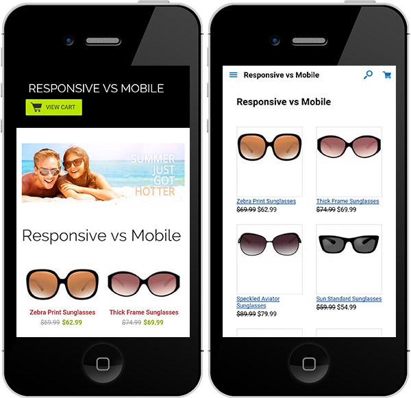
As you can see the site looks fine with the mobile feature but it does not match the original web page as well as the responsive design does. So if you don’t have time to make your site responsive or are not already using one of ShopSite’s many Responsive Designed Themes then turn on the Mobile feature under Preferences. Note that in v12 sp1 you should select the mb_MobileTwo.sst theme. This theme has been optimized to pass Google’s mobile ready tests.
