Recently we had a merchant that was very concerned about adding Facebook Open Graph meta tags to their web pages in order to improve Search Engine Optimization (SEO.) In researching this I could not find any indication that these tags would improve SEO. However, if someone shared to Facebook a product from their site, it could improve how it appeared in Facebook. Fortunately, ShopSite’s newer themes include the relevant tags for product/more info pages.
How the Tags Affect the Look of a Post
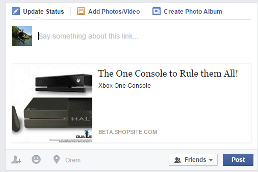
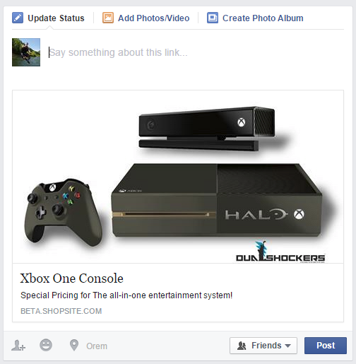
Here are two posts from the same store. The first post uses an older theme with no Facebook Open Graph tags while the second has the tags.

Without Open Graph tags

With Open Graph tags
The first thing you’ll notice is the difference in the size of the image that Facebook used. Images help sell a product, so I’d imagine that a larger image would be more eye catching. Both posts use the same image, but Facebook puts non-Open Graph Stories in a rectangular format and Open Graph ones in a square format.
The next difference is in the text displayed with the products. Remember that each post has access to the same data but, because of a field in ShopSite called “One-Line Advertisement,” it gets tagged for Open Graph. Here’s the setting in this test store from the More Info section:
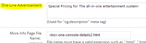
ShopSite automatically tags most of the Open Graph values from existing fields such as Title, Image, etc. But the One-Line Advertisement is unique to posts on social media. It is not used on your store’s web pages or blog, but is used when your page is shared on Facebook. This allows you to highlight for social media as opposed to your web page. On the web site you may need a detailed product description, but for sharing you may want to keep the message short, catchy, or even entirely different for that medium.
What Do These Tags Look Like?
You cannot see the tags when looking at a web page. They are hidden to visitors. Instead you need to view the html source to see them. Viewing the source, you’d see something like this for an older theme not using Open Graph tags:
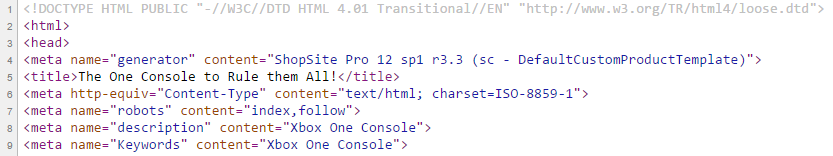
You can see that Facebook used the title and description tags, and figured out where the image was by looking at the page. Here is what the code looks like with a newer theme:
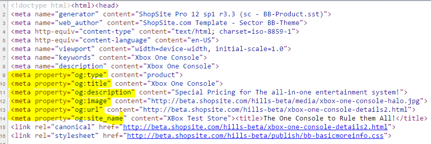
Tags that begin with “og:” are the Open Graph tags used by Facebook. Here there are a number of these tags that are populated from data already supplied to ShopSite when setting up a product’s More Info page. We can see specific data being passed to Facebook such as the type of page (in this example, a product page), the image URL, as well as using the One-Line Advertisement field to populate the og:description. The nice thing is that you as a merchant do not need to spend additional time populating new fields; ShopSite will automatically take your current data and place it in the appropriate fields. The only new field that you can optionally populate is the One-Line Advertisement.
Testing A Post
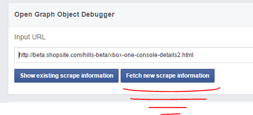
To see how your Facebook share links will appear in a Facebook feed, simply click the “share” button on one of your product pages, or enter the URL for the product page into the “Write Post” field on your Facebook wall, but then don’t complete it by clicking “Post.” However, realize that Facebook saves/caches a copy of your page, you will not see changes reflected on subsequent test posts using the same page or URL. The best way to view what your posts will look like is to use the Facebook Debugger. Just enter a URL of the page you’d want your shoppers to share and view the results. If you make a change to the page, tell the Debugger to “Fetch new scrape information.”
Once you are happy with your post’s look, you can post it yourself if you are running a promotion, or know that you are all set once your shoppers share from your site.
For designers who would like to add these Open Graph social media meta tags to a custom template, please refer to the custom template cookbook for product pages.
 Facebook Marketing: 3 New Features for Page Owners – Web Marketing Today
 Four Methods to Handle Taking Phone Orders in ShopSite – Lexiconn