Mobile for the Merchant
While actual purchasing of merchandise (especially physical goods) is in its infancy on smartphones, merchants have had no problem using their mobile phones for order notification and store monitoring. Even before smartphones (with their accompanying apps and mobile browsers), merchants could have their order notifications sent to their cell phone by way of e-mail and SMS messaging. Likewise, if they had monitoring software checking their site, they could also get e-mail and SMS alerts sent to their cell phones.
Now, with smartphones, there is even more functionality available to the merchant. Of course, you could view your orders and your site from your phone’s browser, but this is not an optimal experience on such small screens. Ideally, your shopping cart software will detect that you are on a mobile browser and change the view that it presents to you.
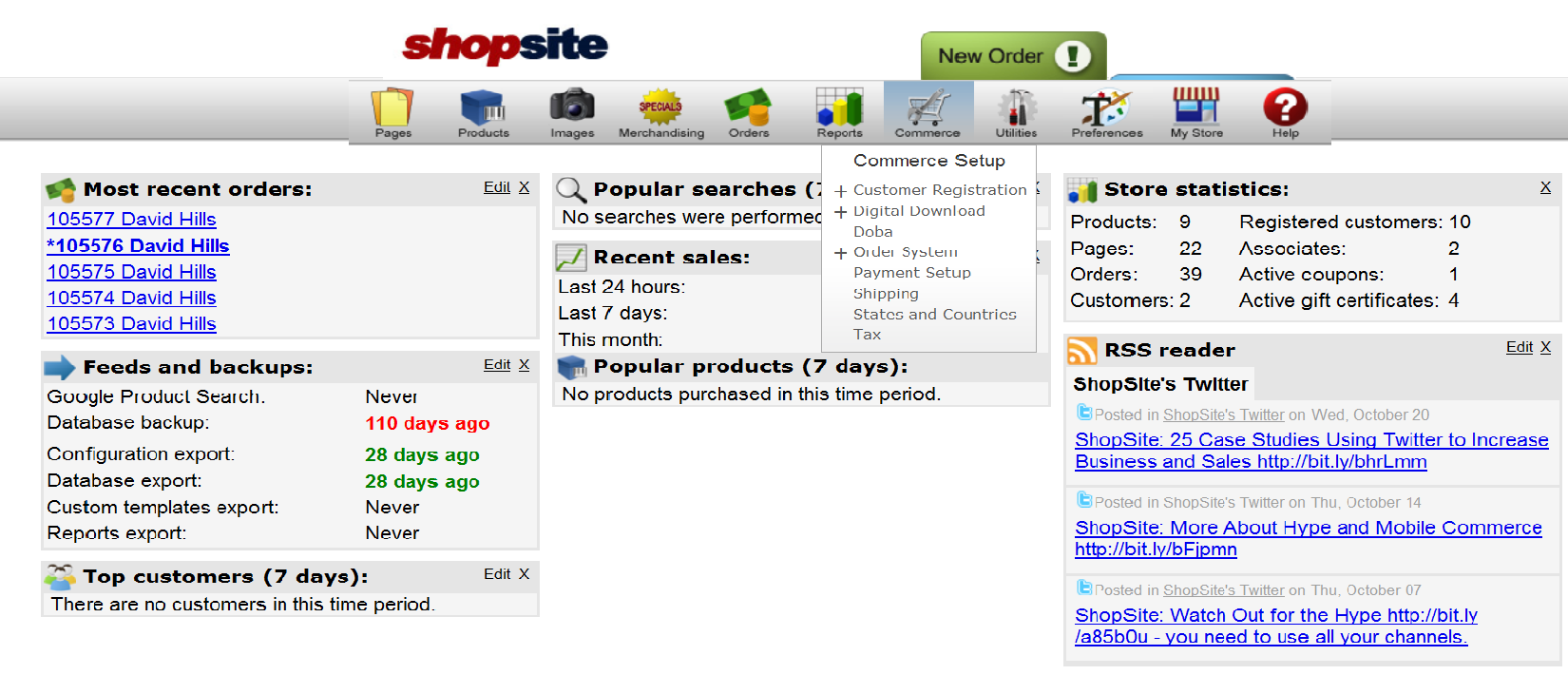
This view optimization was added to ShopSite in v10 sp2 (service pack 2). Below is a typical example of what a merchant might see when they log in to ShopSite from their computer.
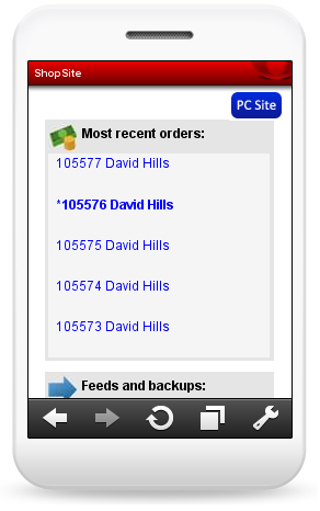
On a mobile browser, this dashboard would provide too much information to display all at once. The merchant would have to constantly pan left and right and up and down to try to read the screen. But ShopSite can detect that a mobile browser is being used and display the information like this:
Note the blue PC Site button in the upper-right, which changes the view from mobile to the usual browser view. Typically, you would not want to switch between views, but it is provided as an option for those who do. The latest orders are displayed with those that have not been previously viewed by the merchant. In this example, the second one in the list (having an asterisk beside it, as well as being bolded) shows an order that has not been viewed before. The orders are links and, in the mobile view, have an extra line between them, so you can clearly select the correct one, even if you have fat fingers like me!
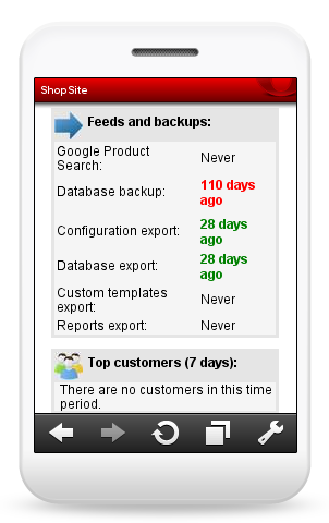
If the merchant scrolls down, they will see the next section of the dashboard.
This next section shows when the last backups occurred, as well as when the last feed was uploaded to Google Product Search. The merchant can continue to scroll down through each dashboard section that has been configured to be displayed.
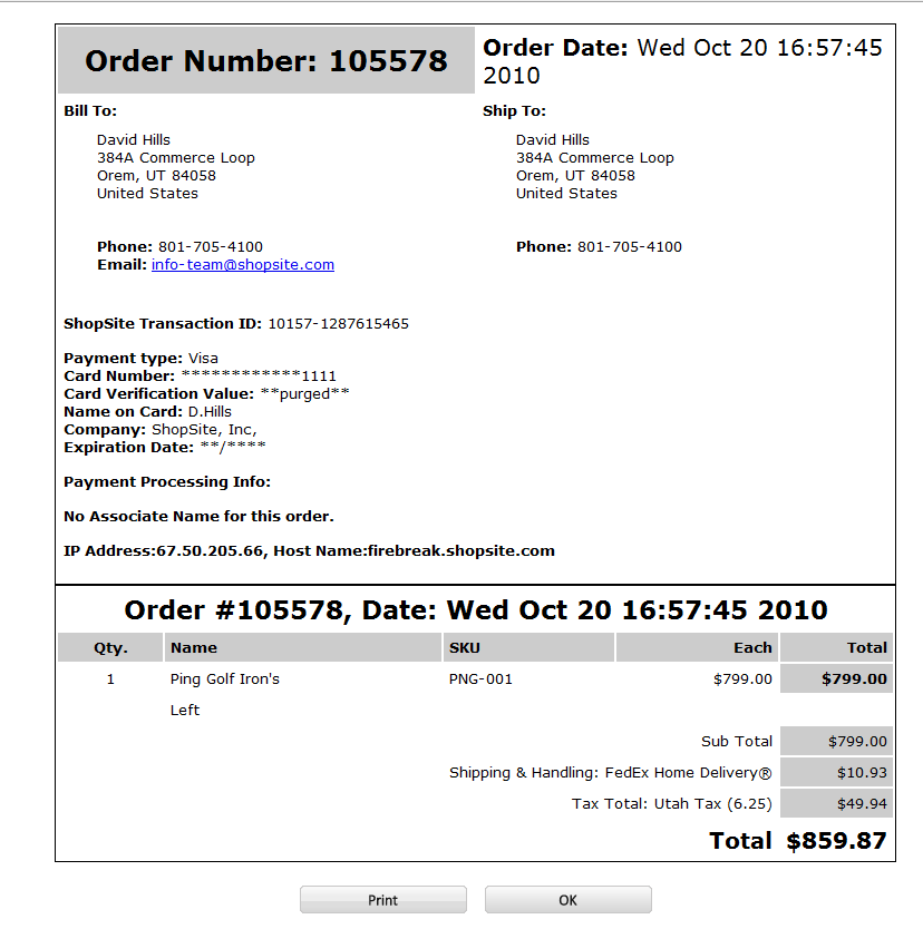
In addition to the dashboard, viewing orders has also been optimized for mobile browsers. First, here is an example of what a typical order would look like when viewed on a regular computer screen:
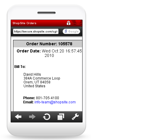
Again, this is too much information to easily display on a regular mobile browser screen, so ShopSite presents the order as follows:
The first thing to be displayed when viewing orders on your mobile phone is the billing information. You can even click the e-mail address and send a message to the shopper from here.
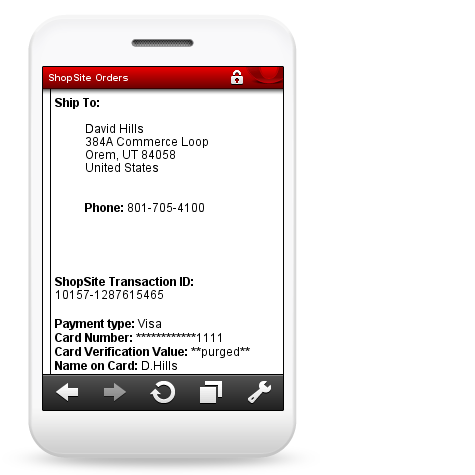
Scrolling down, you’ll then see the Ship To and payment information.
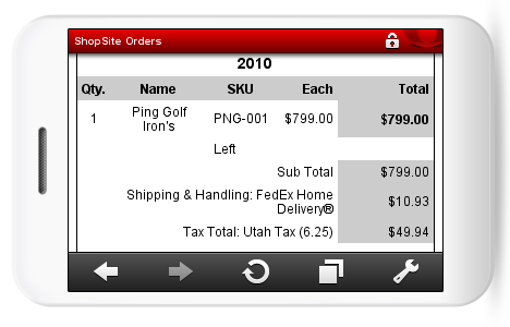
And, if you continue scrolling down, you get to the product information.
Some mobile phones will allow you to view the information in landscape mode instead of portrait mode. ShopSite will display correctly in both orientations, so you can view it however you are most comfortable. Using a real-time payment gateway or PayPal express, you could even bill the order from your phone!
So far, ShopSite has only optimized the Dashboard and Order screens for mobile browsers. You probably wouldn’t want to set up a store from your mobile phone, but if we get feedback that such a feature is wanted, then we’ll make sure to add it in a future release!
