
Imagine you owned a diner. It served good food at a reasonable price. It had a pleasant modern decor and your menus were well laid out with photos of each dish. Now imagine that over half of the people that enter your diner sit down, peruse the menu, express interest in some of the items, then get up and leave before placing their order! What would you do? Would you just shrug your shoulders and think “you win some, you lose some?” Of course not! You’d want to talk to those potential customers and see if they had any concerns, what it would take for them to place an order, and perhaps point out a deal or the special to them.
Likewise, a similar situation plays out every day in online stores. According to Baymard Institute, over 67% of shoppers abandon their cart. There are many reasons this occurs — some are comparing prices and adding products to the cart to see what shipping charges or other fees may apply; some are adding products as a place holder and are thinking they’ll come back later; and some may start to checkout, but they don’t see a payment option they want or a shipping option for their location. If they are having a problem, you’d like to reach out and ask what it was. If they just need a reminder or perhaps an incentive (i.e. coupon), it would behoove you to remind them or offer an incentive. One study indicated a recovery rate of 3-11% for one site while another site that increased a discount from the 2nd to 3rd email achieved a 29% recovery. While you do not necessarily need to offer a discount with the reminder email, it is nice to try different tactics to see what gets you the best return on investment.
ShopSite has had an abandoned cart feature in Pro stores since version 12 sp1. Your site can be sending out abandoned cart email reminders automatically in the background. I’ll explain how to set this up below.
Best Practices
But first, lets cover how to get the shopper’s email. Best practices tell us to avoid slowing the checkout process down, only asking for information when you need it, and even then only asking for what you need. So historically, ShopSite has not asked for the shopper’s email address until you get to the payment screen. Previously the only way to get it sooner was if the shopper registers and signs in before checking out. Now, when the shopper adds a product to the cart you can optionally have a prompt displayed to either register/sign in or give us your email in anticipation of you completing the checkout. For example this is a screen that pops up when a shopper adds their initial product to the cart:
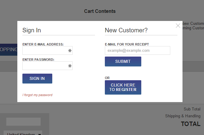
If they enter their email it is remembered and they do not need to enter it again. Likewise for Registering or Signing in. They can even close the box or “Submit” no email and continue to the cart, so at worst it is a minimal inconvenience.
Set Up Automated Emails
Now with the shopper’s email, we are ready to automatically send them reminders. This is set up under Commerce Setup > Order System > Abandoned Cart.
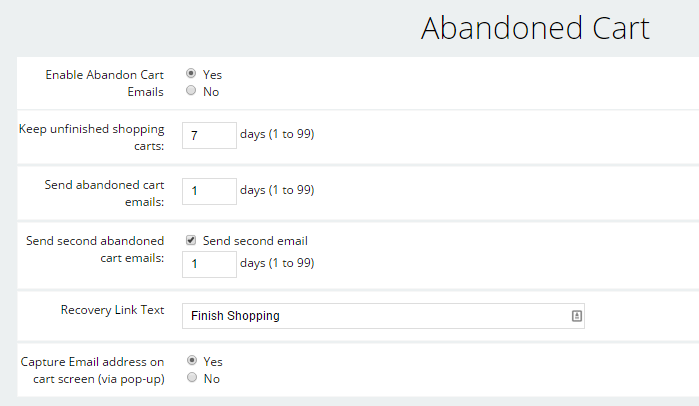
Here you can specify how long abandoned cart files stay around, how may days to wait before sending the first reminder, and if you want to optionally send a second reminder email. You can also see the setting to force that pop-up to capture their email when they add their first product to the cart. Not shown in the image above are sections where you can customize the reminder email. Some sites send the first email as a “reminder” or “did you have a problem/question?” email. They prominently list their phone number and other contact information. The email will also list the product(s) (and optionally, product images) that they left in the cart, as well as a link that will take them directly back to the checkout process.
It is a no brainer to turn on the abandoned cart feature and start turning some of those carts into completed sales!
 4 Harsh Marketing Lessons From 4 Small-Business Owners