Mobile Browser and Mobile Commerce Support

According to internetretailer.com, "83% of global shoppers who use mobile devices plan to make a mobile purchase in the coming year" and Practical Ecommerce says, "Mobile commerce accounts for as much as 23 percent of online sales as of the fourth quarter of 2013, and there is growing evidence that consumers prefer using tablets or other mobile devices to shop, according to reports compiled by conversion rate optimization firm Invesp." All merchants planning to have a successful online business should look in to optimizing their website for mobile visitors (if you have not already).
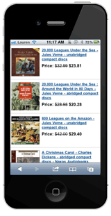
In your ShopSite store you can easily enable mobile browsing. There are two main ways that merchants can optimize their website for mobile devices, Responsive Design or with automatic mobile CGI redirects. ShopSite Version 12 added 9 new built-in themes for merchants to choose from for their store look and feel; all 9 new themes are created with responsive design, and all themes added since then are responsive as well. All older themes use dynamically generated pages. Customers accessing your site with their mobile devices can use the dynamic mobile-friendly interface to browse and shop in your store.
What is Responsive Design? Responsive Design is basically three templates in one. It allows your store to publish only one page, but that page has code to change its layout based on the browser being used to view it. This allows you to have a nice, professional site no matter if your customer is viewing it from a desktop, tablet, or smartphone. ShopSite version 12 has nine Responsive Design Themes which you can choose from: Deskman, Composer, Response, Brownie, Shower, Stripped Down, Content Focus, Underline, and Floating Page.
Setting Up Mobile CGI Redirects
The video tutorial below goes through the setup process for adding mobile device support to your ShopSite store. Mobile support is available in ShopSite Pro stores.
You can also find more setup instructions at the URLs listed below. The ShopSite Help link will give end users instructions and more information on setting up mobile support in their ShopSite store. The Custom Template Cookbook link is for designers and provides more information on adding mobile support to their custom templates built for ShopSite shopping cart ecommerce stores.
ShopSite Help - Mobile Configuration Screen
Custom Template Cookbook - How To Add Mobile To Your Custom Templates
Responsive Design with a Custom Template
If you are a designer who would like to learn more about Responsive Design so that you can create your own custom templates using this slick mobile feature, you can refer to the Responsive Design Overview document in the custom template cookbook.